 Get full access to premium PowerPoint templates at a limited-time price.Get Now
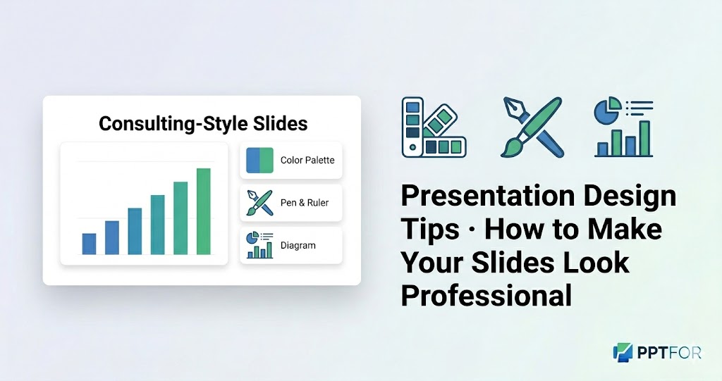
Great content can get lost if your slides look cluttered or inconsistent. A few simple design choices—like layout, colour, and typography—can make your deck look more credible, easier to follow, and more persuasive.
In this guide, you’ll learn:
If you already have a template, you can skip to the design checklist or the FAQ at the end.
When you present, your audience doesn’t just listen to your words—they also judge your slides. A messy layout, too many fonts, or clashing colours can make an otherwise strong message look unprofessional.
Strong presentation design helps you:
Templates in the Presentation Design Tips category are built with clean layouts and clear visual hierarchy, so you can focus on your message instead of formatting.
Good layout is less about “making it look pretty” and more about how comfortable it feels to look at.
Line up your text, images, and charts to an invisible grid. When everything aligns, the slide looks instantly cleaner and easier to read.
Don’t fill the entire slide with content. Use margins and padding so the eye has room to rest and the key elements stand out.
Keep related text, numbers, and charts close together, and separate unrelated sections with space. This makes your deck feel more organized and logical.
Colour and typography are silent signals of your professionalism. Even small changes here can make a big difference.
Stick to 2–3 main colours: one for your brand or primary sections, one accent colour, and a neutral background. Avoid using many different colours on the same slide.
Use a clear, sans‑serif font for body text (like Open Sans, Inter, or Helvetica) and a slightly bolder or larger font for titles. Avoid highly decorative fonts for anything important.
Use cooler colours (blue, green) for calm, analytical content and warmer colours (orange, red) sparingly for emphasis or warnings. Keep charts and data pages easy to scan at a glance.
Charts and images can make your deck more engaging, but they can also make it confusing if they’re too complex.
Use bar charts, line charts, or simple tables. Avoid 3D effects, stacked charts, or too many categories. One clear message per chart is enough.
Simple icons can replace long labels or complex diagrams. Use them consistently and keep them the same size and style on all slides.
Use shapes, lines, or background elements only to guide attention, not to fill empty space. If an element doesn’t help understanding, remove it.
Consulting‑style decks look clean, minimal, and data‑driven. You can achieve a similar feel with a few simple rules.
Limit each slide to one main message. If a slide tries to explain several things, break it into multiple slides.
Replace long paragraphs with short bullets, labels, and visuals. Write your slides so they support your talk, not replace it.
Use the same title position, chart style, and spacing across all slides. This makes your deck look like part of a single, professional series.
Templates from the PPTFOR downloads library are built with consulting‑style layouts and simple data pages, so you can adopt this style without starting from scratch.
Focus on layout, colour, and typography: keep your layout clean and aligned, use a simple colour palette, and choose readable fonts. These three changes make the biggest impact with the least effort.
Start by removing clutter, aligning elements, and making your colours and fonts consistent. Templates in the PPTFOR downloads section already follow these principles, so switching to one of them can upgrade your deck instantly.
Most professional decks use no more than two fonts: one for headings and one for body text. More than two fonts can make your deck look chaotic.
Yes. You don’t need to be a designer to use clean layouts, consistent colours, and simple charts. Use templates from the Presentation Design Tips category as a starting point, then adapt them to your brand.


Get full access to our entire collection of premium PPT templates for one simple price.
Forget about complex tools or technical skills—just choose, edit, and download.