 Get full access to premium PowerPoint templates at a limited-time price.Get Now
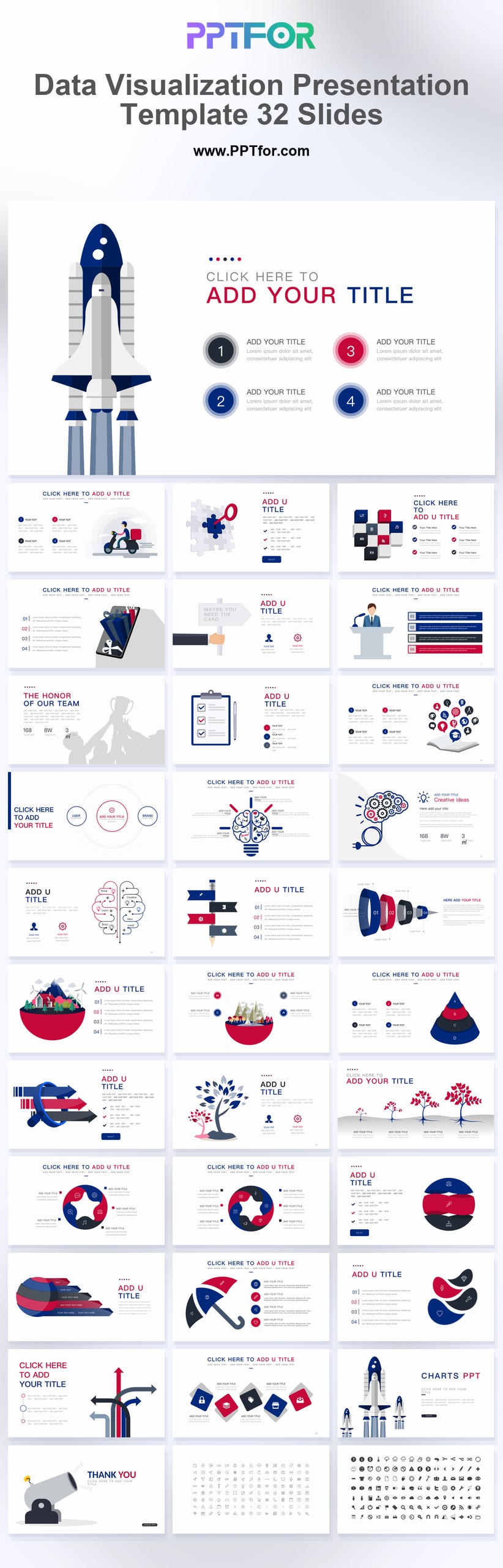
The Data Visualization Report Presentation Template provides 32 red-and-white slides for visual reporting. Use the charts and analysis layouts to compare results, show a trend, and explain the business implication beside the visual.
Choose this report when the presentation depends on a small number of visual comparisons. Match the chart to the question and use red selectively so it does not imply an alert on every slide.
Bring clean source figures, units, categories, dates, and an intended takeaway for each chart. Check that comparisons use the same scale and identify any missing or estimated values.
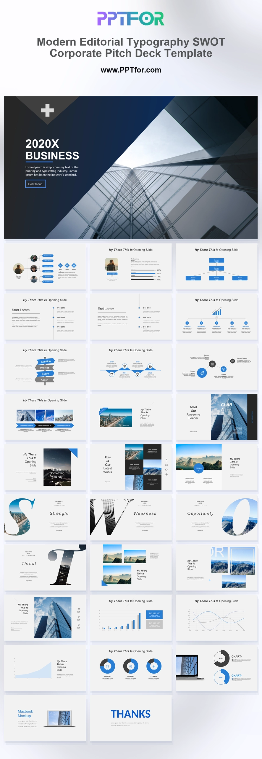
The template supports SWOT, market analysis, data analysis, and data visualization layouts, giving teams a clear structure for presenting research context, comparisons, key metrics, and report conclusions.
Edit the text, colors, and slide elements to match your presentation. Before updating a graphic, check whether it is a native chart, a grouped shape, or an image; the editing method differs.

Get full access to our entire collection of premium PPT templates for one simple price.
Forget about complex tools or technical skills—just choose, edit, and download.