 Get full access to premium PowerPoint templates at a limited-time price.Get Now
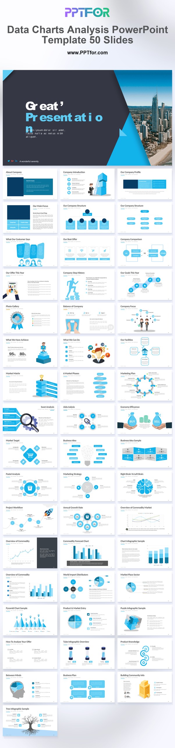
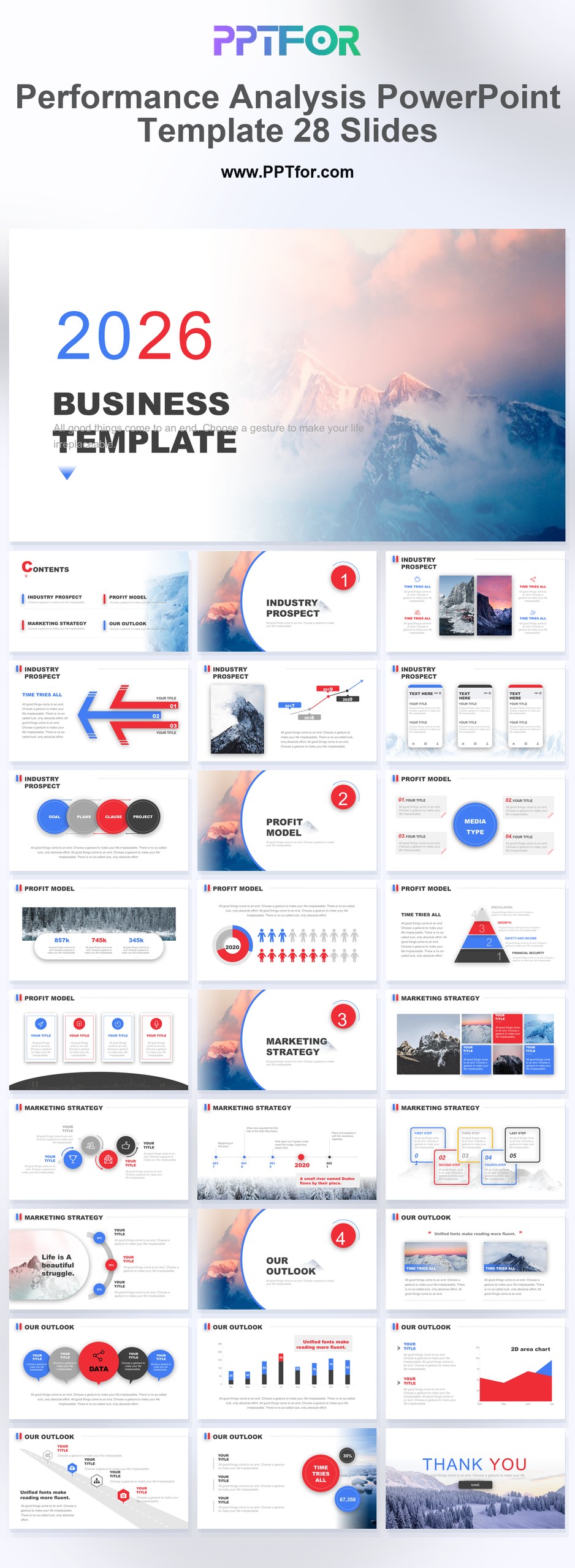
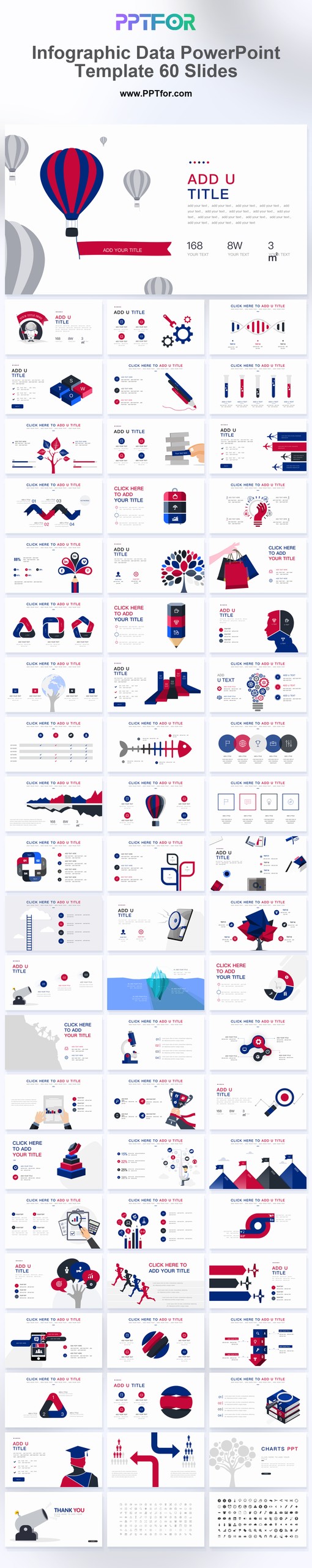
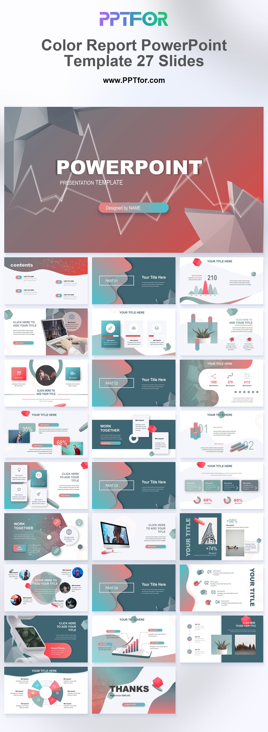
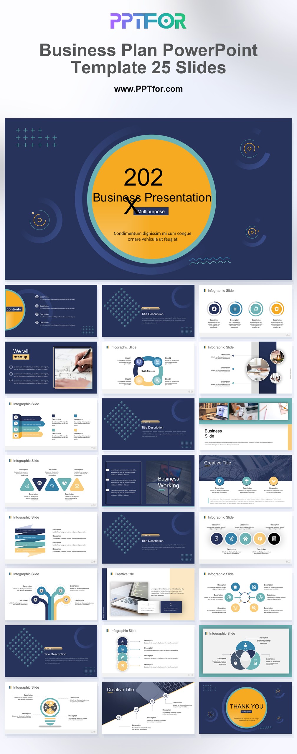
Data Visualization templates give analysts, marketers, consultants, and executives a focused collection of layouts for turning key metrics, dashboard visualization concepts, and performance indicators into presentation-ready stories. This tag supports reporting work where numbers need context, comparisons need structure, and insights must be easy for decision-makers to interpret.
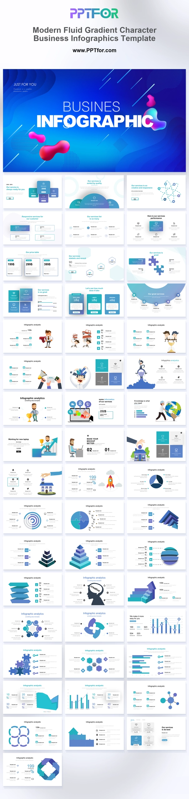
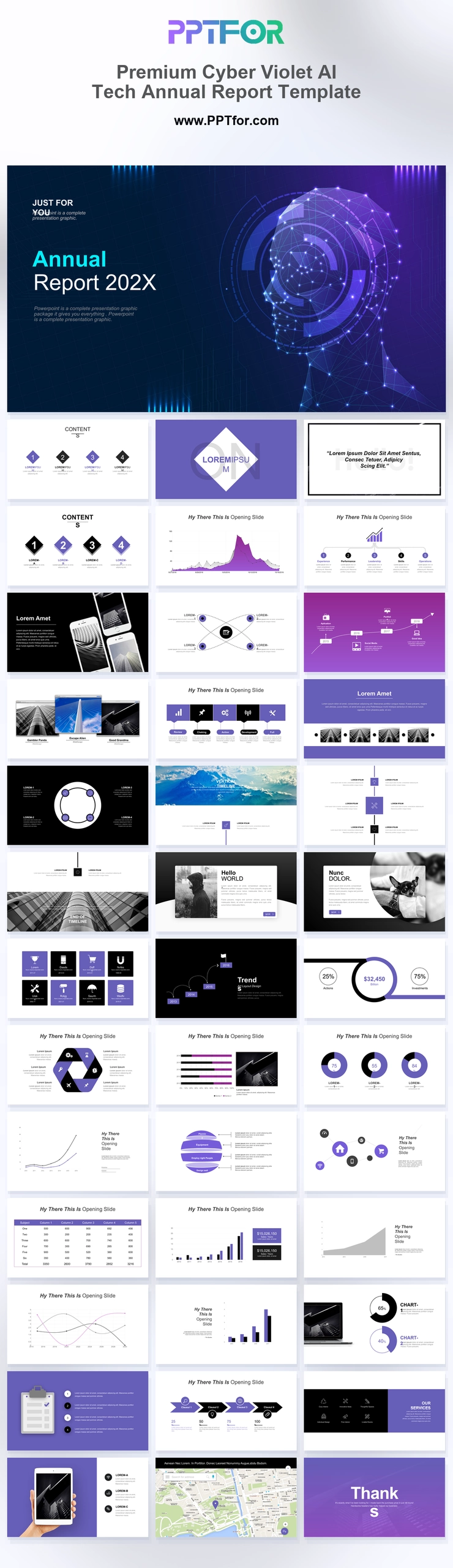
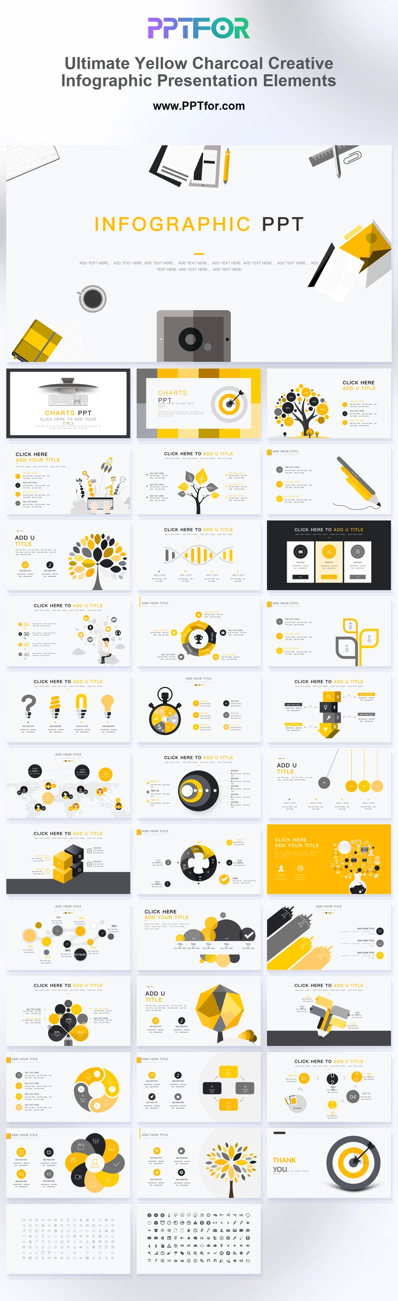
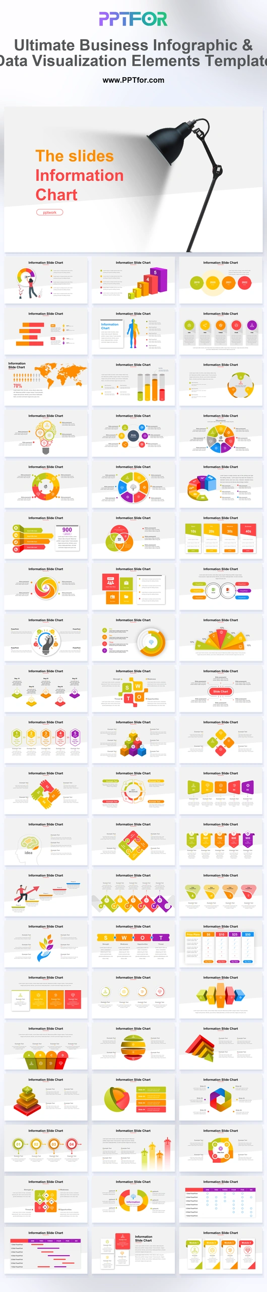
The Data Visualization collection can include formats for analytics reports, KPI summaries, trend analysis, market research, campaign reviews, and executive performance updates. Some templates may emphasize structured charts or infographic-style layouts when included in the individual product, while others focus on clean reporting pages and data-driven insights. Many templates commonly support Microsoft PowerPoint, Google Slides, and Apple Keynote, with editable slide structures that help users adapt colors, fonts, layouts, and content for business reviews, client presentations, or recurring reporting cycles.
Data Visualization templates are used to present metrics, trends, comparisons, KPI updates, research findings, and business performance results in a structured slide format for decision-makers.
Yes, many templates commonly include editable layouts, colors, fonts, and slide elements, allowing teams to adapt report pages, comparison sections, and metric-focused content to their needs.
Most templates commonly support Microsoft PowerPoint, Google Slides, and Apple Keynote, though buyers should review each product page to confirm exact compatibility and included file formats.
They save time by providing structured layouts for findings, comparisons, and recommendations, so teams can spend more effort interpreting results instead of formatting report slides.
Get full access to our entire collection of premium PPT templates for one simple price.
Forget about complex tools or technical skills—just choose, edit, and download.