 Get full access to premium PowerPoint templates at a limited-time price.Get Now
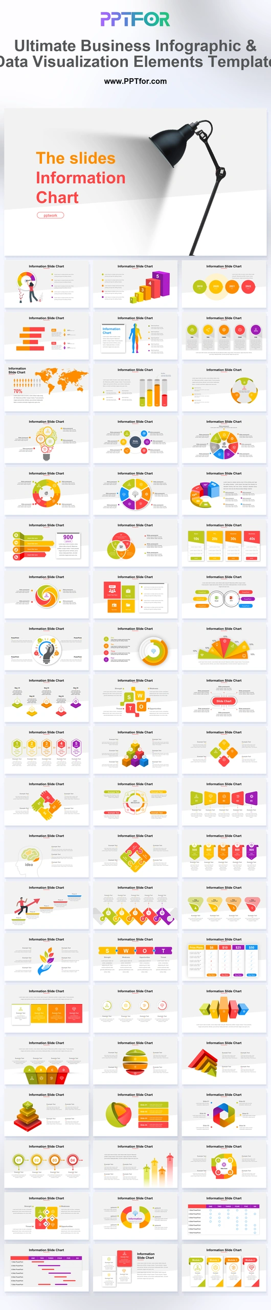
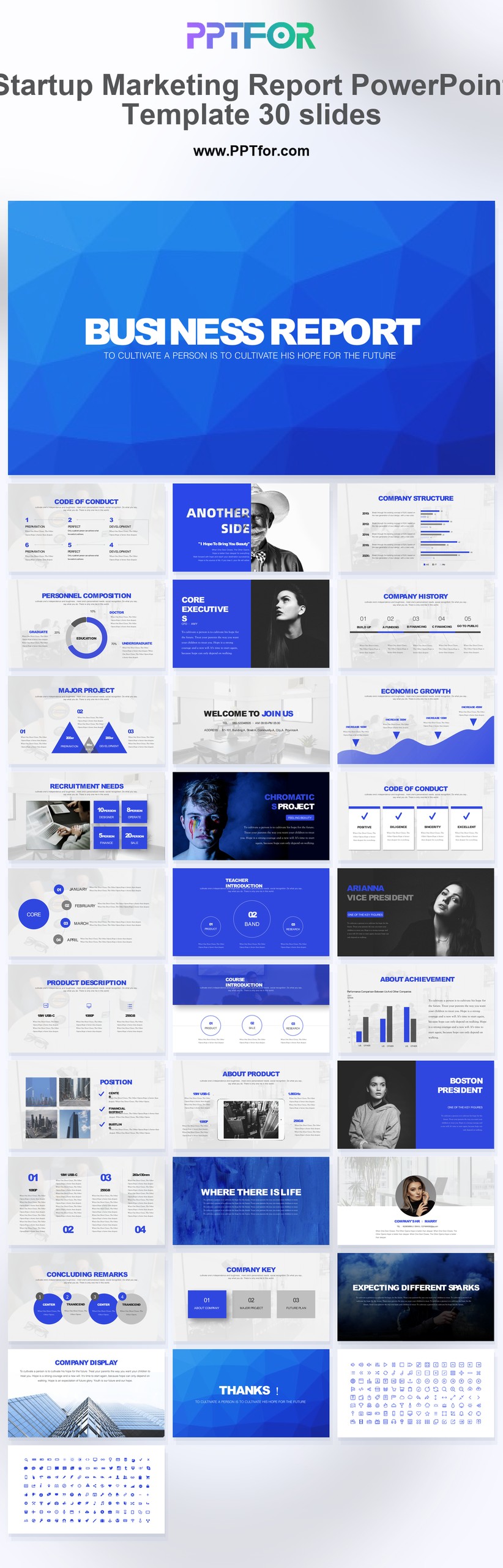
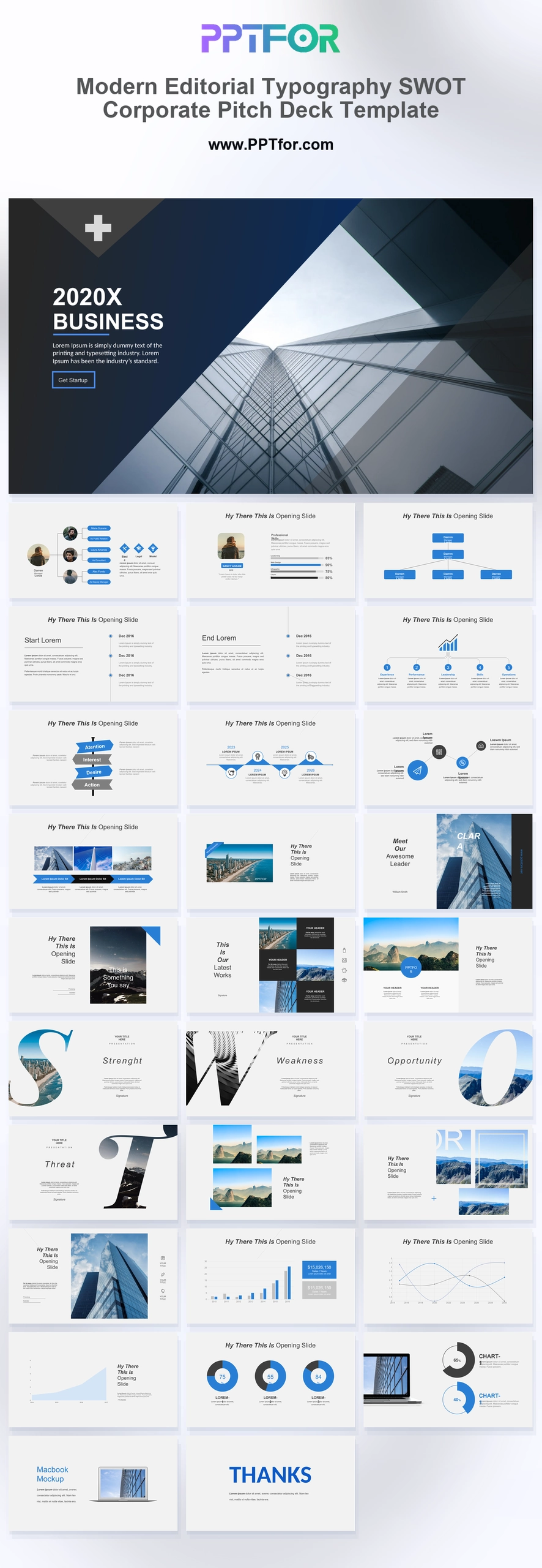
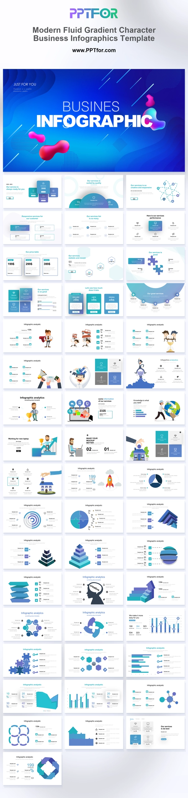
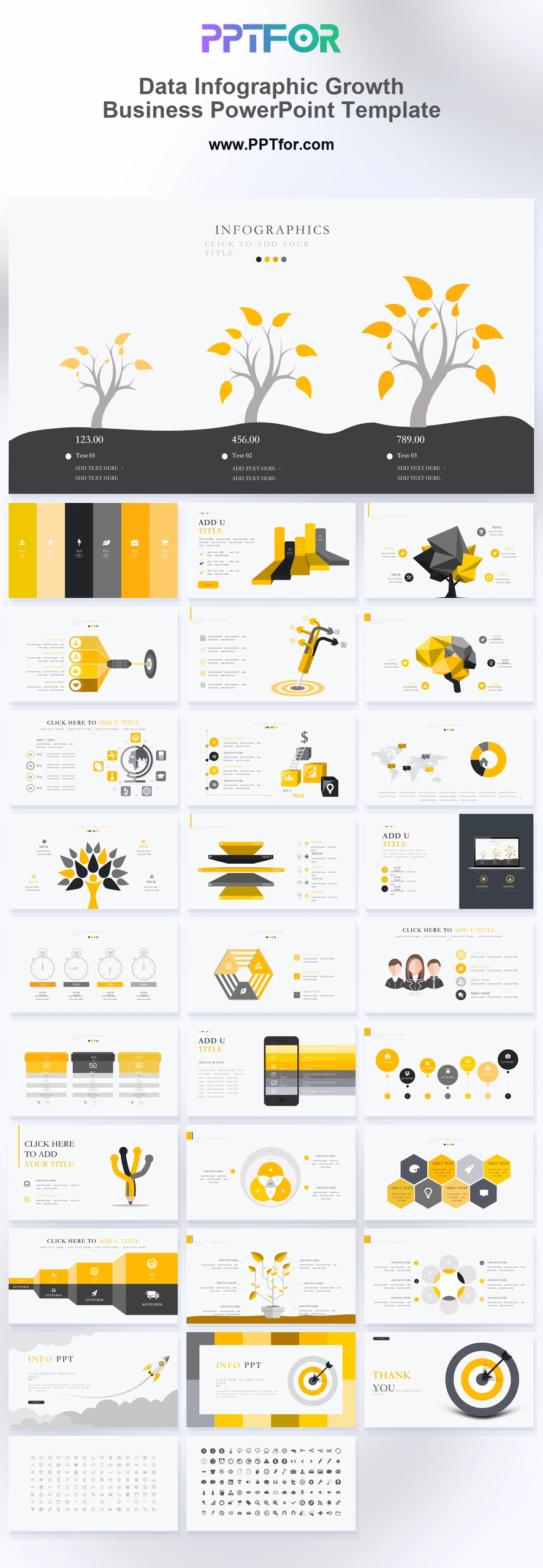
The Business Infographic and Data Visualization Template provides 45 slides with funnels, comparison grids, Gantt timelines, and process diagrams. Use the collection to explain performance and the activities behind it within an existing report.
Visual elements include flat multi-color palettes, 3D stacked pyramids, puzzle piece workflows, segmented donut charts, geometric layer diagrams, lightbulb ideas, and continuous chevron processes.
Choose this set when the same presentation must show both numerical comparisons and workflows. Match chart type to data and use process diagrams for sequence, not as substitutes for measured proportions.
Bring validated figures, labels, units, and dates for charts, plus owners and dependencies for timelines. Write a short conclusion for each visual before adding it to the report.
The deck includes step-up bars, silhouette profiles, world maps, lightbulb nodes, 3D pyramids, puzzle workflows, SWOT matrices, pricing tables, gear processes, funnel visuals, Gantt timelines, and multi-row comparison grids.
Edit the text, colors, and slide elements to match your presentation. Before updating a graphic, check whether it is a native chart, a grouped shape, or an image; the editing method differs.

Get full access to our entire collection of premium PPT templates for one simple price.
Forget about complex tools or technical skills—just choose, edit, and download.