 Get full access to premium PowerPoint templates at a limited-time price.
good powerpoint templates
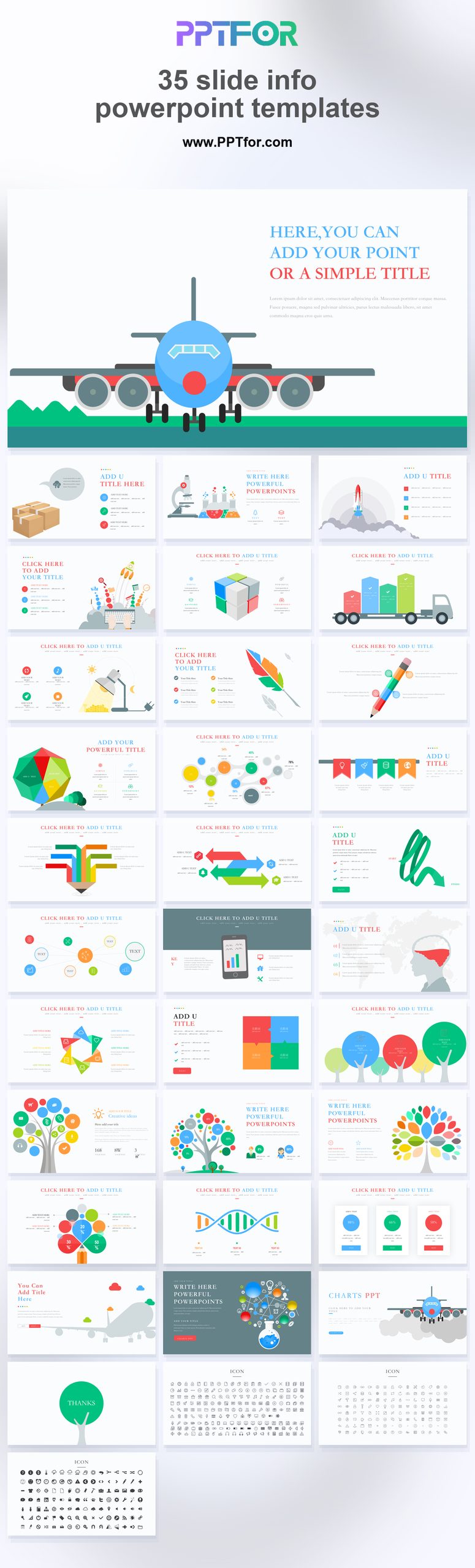
This Blue Infographic PowerPoint Template provides 35 slides for business metrics, timelines, comparisons, and process diagrams. Use it to explain a result or sequence with the supporting figures and conclusion on the same slide.
The blue infographic layouts use a consistent corporate style across charts and diagrams. Choose a chart for numerical comparisons and a process diagram for steps or relationships.
Choose this deck when a report needs several types of diagrams in a consistent blue style. For dense financial statements, keep the detailed tables in an appendix and use these slides for the main findings.
Start with verified figures and a clear comparison. Prepare the reporting period, metric definitions, source figures, and one takeaway for each chart. For process slides, identify the steps and decision points before choosing a diagram.
You can change the colors of editable shapes and text. Review individual charts, icons, and images after applying a theme so the same category retains the same color throughout.
Use the PPTX file in PowerPoint for Mac. If you import it into Keynote, review fonts, diagrams, and image placement; conversion can change the layout.
Start with the prepared layouts and replace the sample text and data. Familiarity with text boxes, chart editing, and image cropping will help you adapt the slides accurately.
You can import a PPTX file into Google Slides. Review fonts, chart labels, and diagram spacing after import rather than assuming that every element will retain its original appearance.
Use the blue infographic slides as a selection of visual layouts: keep only those needed to explain your report, and retain source tables as supporting material.
Browse the PowerPoint template collection or see related designs in Data & Analytics Reports.
good powerpoint templates

Get full access to our entire collection of premium PPT templates for one simple price.
Forget about complex tools or technical skills—just choose, edit, and download.