Avatar

3D Glossy Multi-Layered Infographic Toolkit

by PPTFOR Editorial Team in Data & Analytics Reports

3D Glossy Multi-Layered Infographic Toolkit

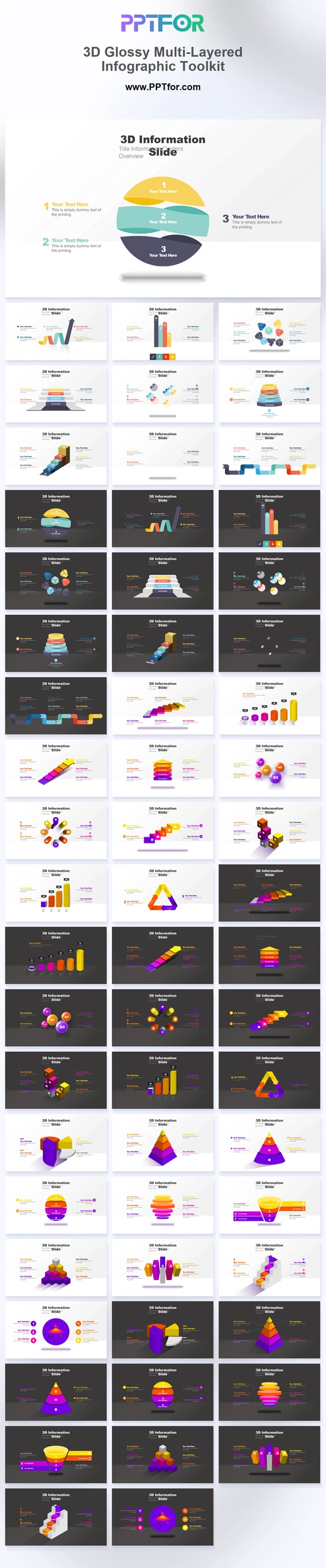
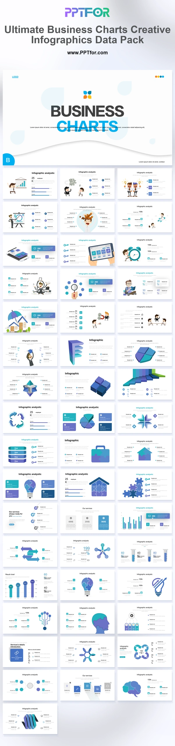
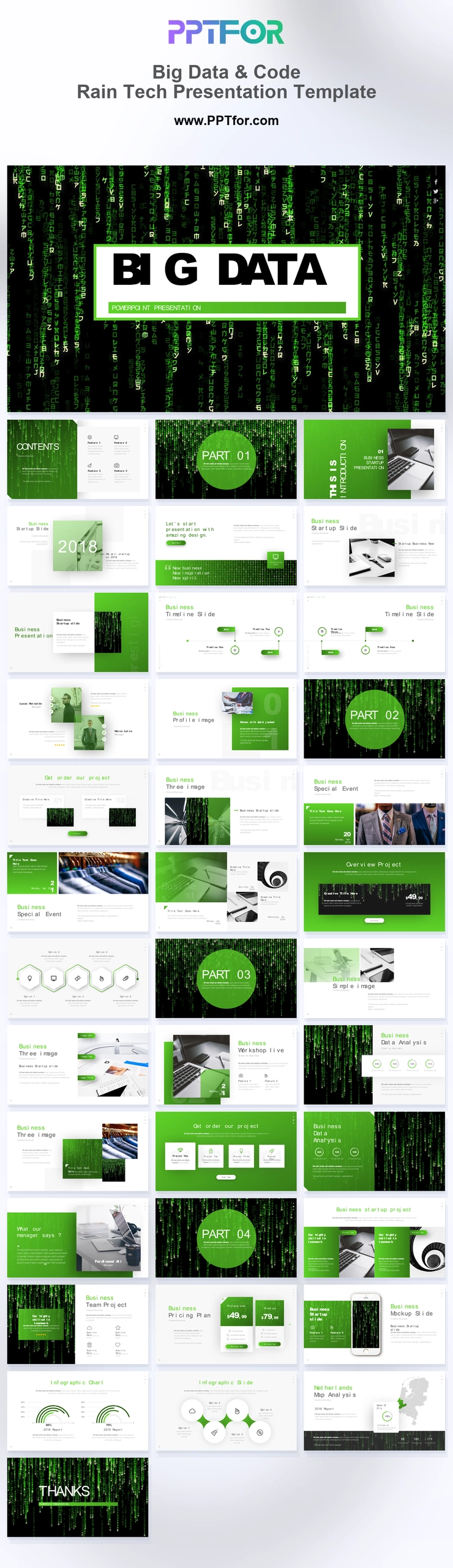
The 3D Glossy Multi-Layered Infographic Toolkit provides 60 slides for data and process presentations. Layered pyramids, segmented spheres, and geometric graphics offer visual options for explaining categories, hierarchies, and business relationships.

Visual elements include high-gloss 3D geometric shapes, segmented spheres, layered pyramids, neon fluid gradients, light and dark backgrounds, and quantitative data models.

  • Compatibility: Microsoft PowerPoint. Check fonts, charts, and image placement after importing into Google Slides or Keynote.
  • Aspect Ratio: 16:9 widescreen
  • Graphics: Editable vector graphics
  • Placeholders: Drag-and-Drop Placeholders
  • Editability: Editable text, colors, fonts, and layouts
  • Slide Count: 60 slides

Suggested Uses and Presentation Tasks

  • Data analysts building annual reports – use 3D comparison graphs, pyramids, and sphere diagrams to make high-density findings easier to scan.
  • CFOs preparing financial audits – present segmented data models, layered matrices, and KPI visuals for clearer executive financial review.
  • Operations directors modeling complex processes – turn cylindrical flowcharts, ring processes, and triangular frameworks into structured operational diagrams.
  • Business intelligence leads creating KPI dashboards – combine light and dark background sets with quantitative graphics for boardroom-ready performance views.
  • Project portfolio managers comparing initiatives – use multi-column graphs, funnel layouts, and spiral growth indicators to explain progress and priority shifts.
  • Market researchers presenting quantitative reviews – visualize survey patterns, segment comparisons, and research findings with glossy dimensional infographic layouts.
  • Strategic consultants explaining process architecture – use cluster networks, pyramid matrices, and geometric loops to clarify complex transformation models.

Frequently Asked Questions

When should I choose this template?

Choose this toolkit when a layered relationship benefits from a visual model. Use a simple chart where precise numerical comparison matters, because perspective and decorative volume can make values harder to compare.

What should I prepare before editing?

Prepare category labels, hierarchy levels, process relationships, and any source figures. Clarify which dimensions are proportional to data and which are decorative parts of the illustration.

What infographic layouts are included in this 60-slide toolkit?

The toolkit includes split sphere core diagrams, multi-column comparison graphs, layered pyramid matrices, funnel and cone layouts, cylindrical flowcharts, spiral staircase growth indicators, spherical cluster network sheets, geometric ring processes, and triangular loop frameworks.

How can I edit the template?

Edit the text, colors, and slide elements to match your presentation. Before updating a graphic, check whether it is a native chart, a grouped shape, or an image; the editing method differs.



Post a Comment

$15

$

  • Price is in US dollars and excludes tax
  • Size:16x9
  • Microsoft PowerPoint, Google Slides, Apple Keynote, PowerPoint for Mac / Office 365, WPS Office
  • 100% editable
  • What you see is what you get
  • This is a secure SSL encrypted payment. Credit Card Certificate

Get all products for only $29!

Get full access to our entire collection of premium PPT templates for one simple price.
Forget about complex tools or technical skills—just choose, edit, and download.