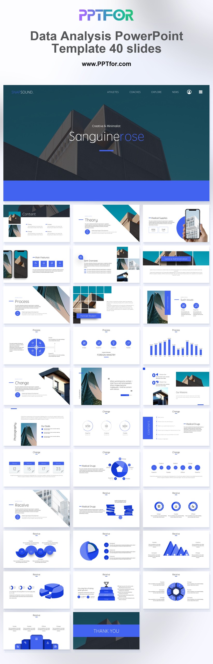
 Get full access to premium PowerPoint templates at a limited-time price.Get Now
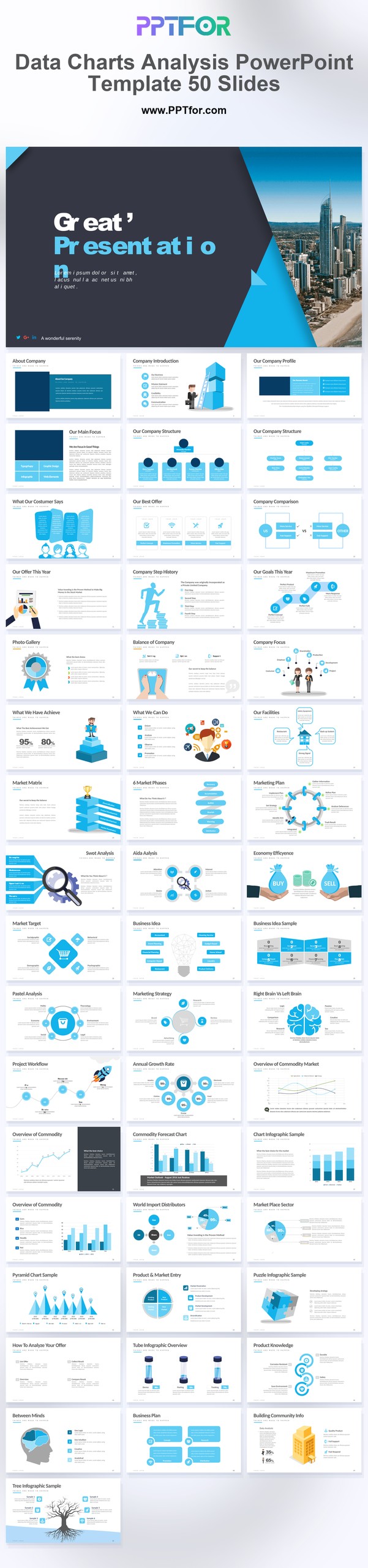
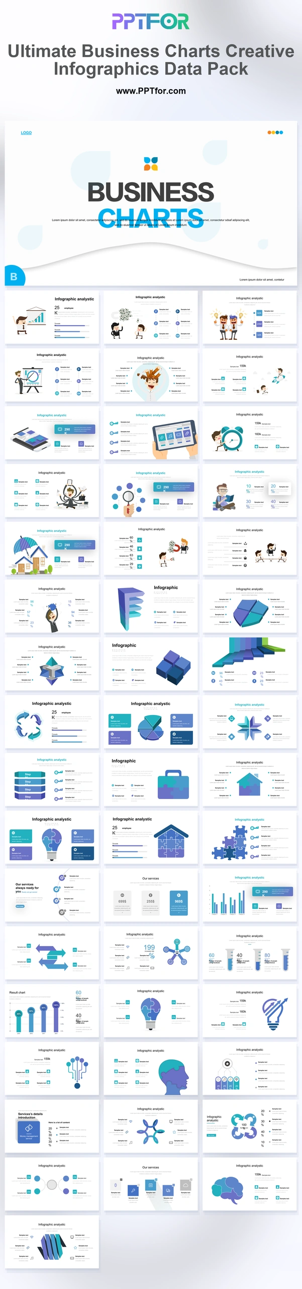
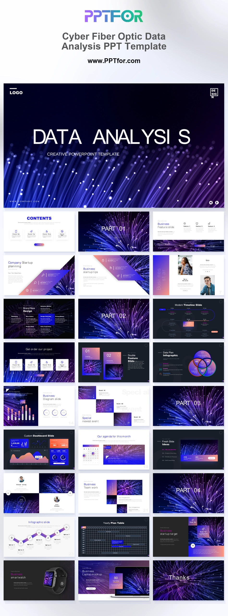
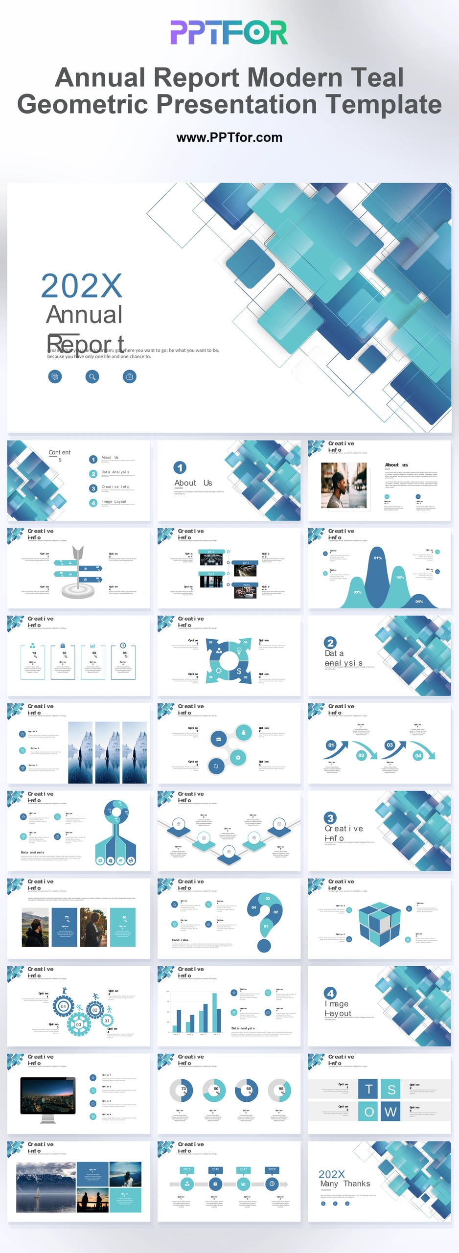
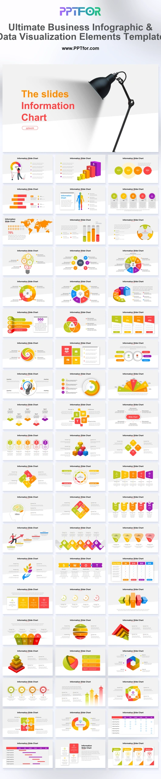
The Data Charts Analysis PowerPoint Template provides 50 blue-and-white slides for presenting an analytical report. Use the chart-led layouts to move from detailed comparisons to a concise explanation of the finding and its business relevance.
Choose this set when the analysis needs several views of the same dataset. Keep the main result in the presentation and use additional charts to answer likely questions about segments or time periods.
Prepare validated datasets, segment definitions, units, and source notes. Document any filters and missing observations so differences between charts can be explained during the review.
This template features a chart-led business analysis style with data visualization, business charts, and infographics. The blue and white color system provides a consistent reporting style while keeping attention on measurable findings.
Edit the text, colors, and slide elements to match your presentation. Before updating a graphic, check whether it is a native chart, a grouped shape, or an image; the editing method differs.

Get full access to our entire collection of premium PPT templates for one simple price.
Forget about complex tools or technical skills—just choose, edit, and download.