 Get full access to premium PowerPoint templates at a limited-time price.Get Now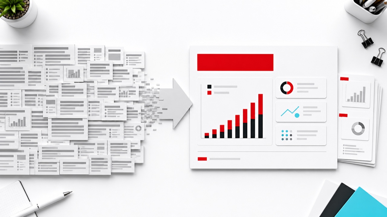
To make a text-heavy PowerPoint slide readable, separate the decision message from the supporting detail. Put one conclusion in the headline, show only the evidence needed to understand it, and move definitions, methodology, or regulatory detail to supporting slides or an appendix. Layout cannot rescue content that has no priority.
This does not mean every slide must contain only a few words. A presentation slide and a leave-behind document serve different purposes, and some legal, technical, or educational content genuinely requires detail. The goal is to create an explicit reading order.
A live presentation supports a speaker. The audience needs to grasp the main message quickly while listening. A leave-behind may be read without the presenter, so it can contain more evidence and explanation.
If one file must serve both purposes, use a layered structure:
Trying to make every slide simultaneously brief, complete, visual, and self-explanatory usually creates compromise rather than clarity.
Replace a topic title such as “Customer Survey Results” with a conclusion such as “Renewal intent fell because onboarding time increased.” The headline tells the audience what the evidence means.
Remove background information that does not change the conclusion. A useful test is: if this sentence disappeared, would the audience reach a different decision? If not, it can move to notes or backup.
Use columns, a sequence, comparison rows, or a hierarchy when ideas have a consistent relationship. Do not place paragraphs inside decorative shapes. The visual form should explain how the information connects.
If the slide has several conclusions, create several slides. Reusing one strong layout is better than reducing the font until everything fits.
Create a detailed appendix slide with the full table, method, policy text, or quotation. Link to it during questions if required. This keeps the main narrative concise without discarding important evidence.
Use a takeaway headline, one chart or table, and a short implication box. This is effective for executive and consulting presentations.
Place three concise findings on the left and a structured evidence panel on the right. Keep both areas aligned to the same reading order.
Show the decision-level result in the main deck and provide the complete calculation or source material later. Add a consistent appendix label so the relationship is clear.
Divide a long process, policy, or lesson into consecutive slides. Repeat the section header and highlight the current step so the audience does not lose context.
Editable infographic systems can speed up this work. Compare the Corporate Blue Comprehensive Business Infographics Template, Ultimate Multi-Color Business Infographics Mega Element Pack, and Business Infographic & Data Visualization Template.
Do not hide required text or reduce it below readable size. Instead:
The presentation should direct attention to the relevant part without implying that omitted detail does not exist.
For a broader design audit, read How to Improve Slide Readability for Executive Presentations. For data-heavy pages, use Analysis Report PPT: How to Present Data Clearly.
There is no universal word limit. Text is excessive when the audience cannot identify the message and evidence within the time available, or when reading prevents them from listening to the presenter.
Only when the icon communicates a familiar meaning. Decorative icons do not reduce cognitive load if the audience must still read the same paragraph.
Yes. Use clear sections, consistent typography, adequate spacing, a visible reading order, and a concise takeaway. Density and disorder are not the same thing.
Put essential context before the analysis and supporting evidence in an appendix. Avoid spending most of the presentation on history before the audience knows the decision or question.
Get full access to our entire collection of premium PPT templates for one simple price.
Forget about complex tools or technical skills—just choose, edit, and download.