 Get full access to premium PowerPoint templates at a limited-time price.Get Now
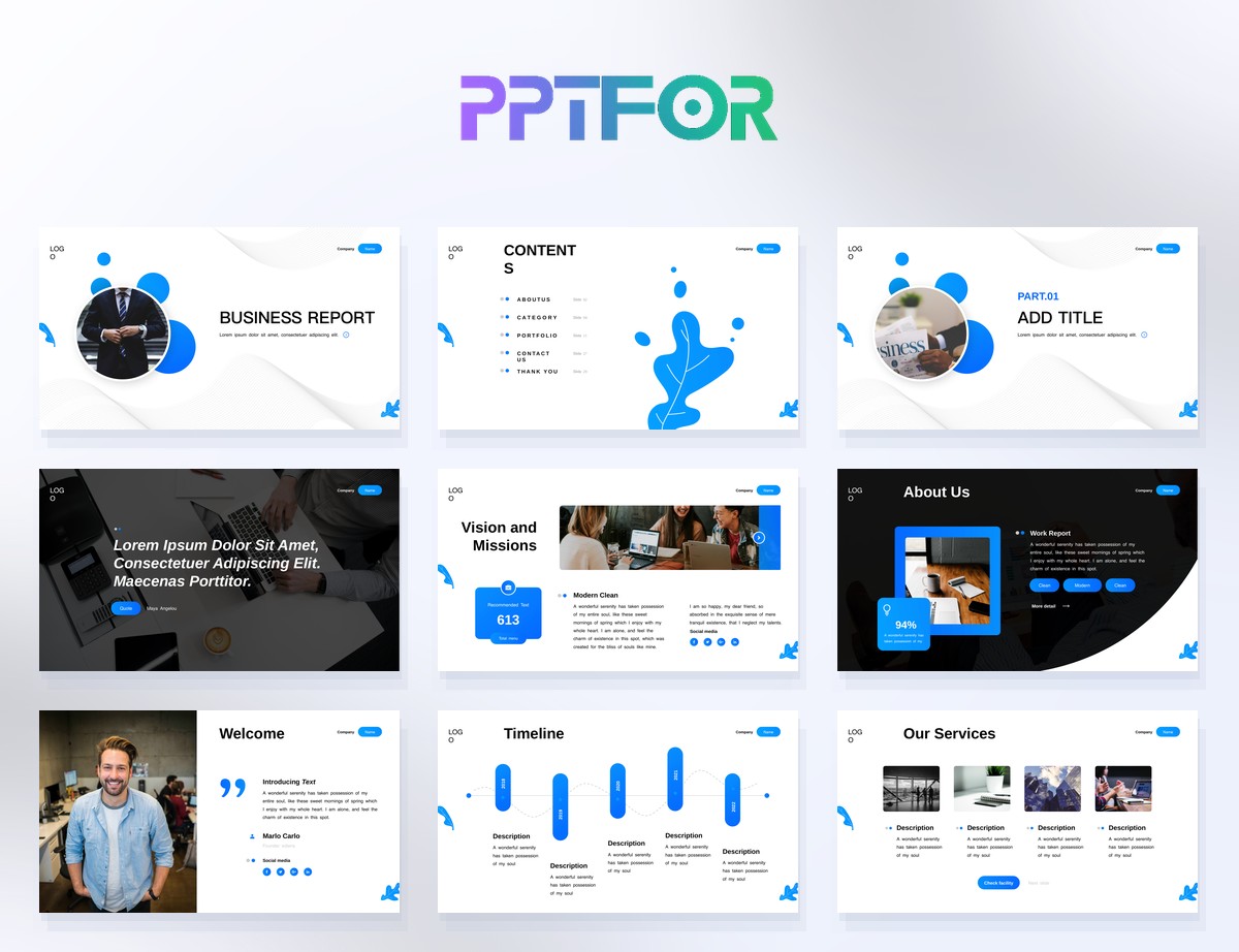
Creating an analysis report PPT is one of the most common tasks for business, product, finance, and analytics teams. A good analysis report PowerPoint doesn’t just show numbers; it turns raw data into a clear story that decision‑makers can understand in a few minutes.
In this guide, you’ll learn:
If you already have slides, you can skip to the step‑by‑step checklist or the FAQ at the end.
An analysis report PPT is a slide deck that explains your data, key findings, and recommendations. You might use it for marketing performance, financial results, product usage, user research, or any other type of quantitative or qualitative analysis.
The goal of an analysis report PPT is not to show every data point. Instead, it should:
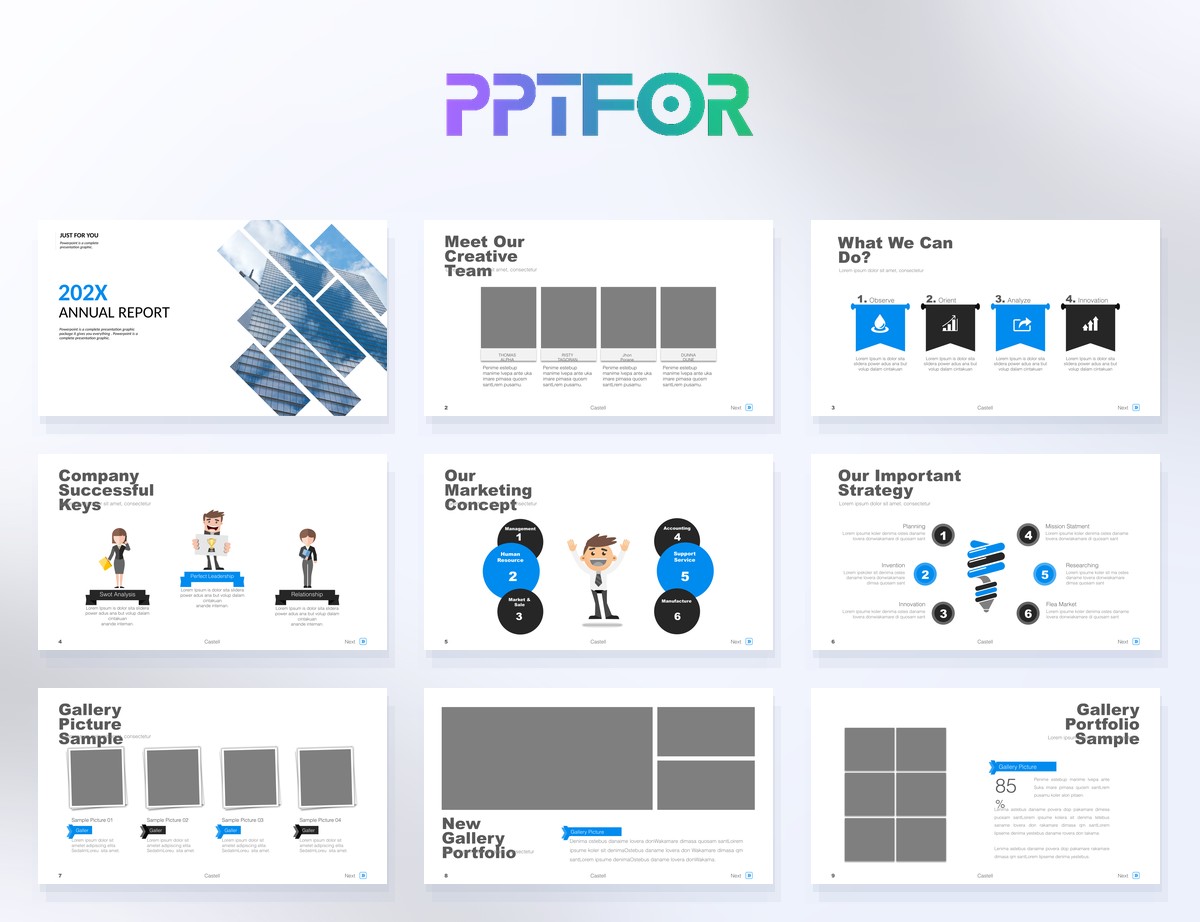
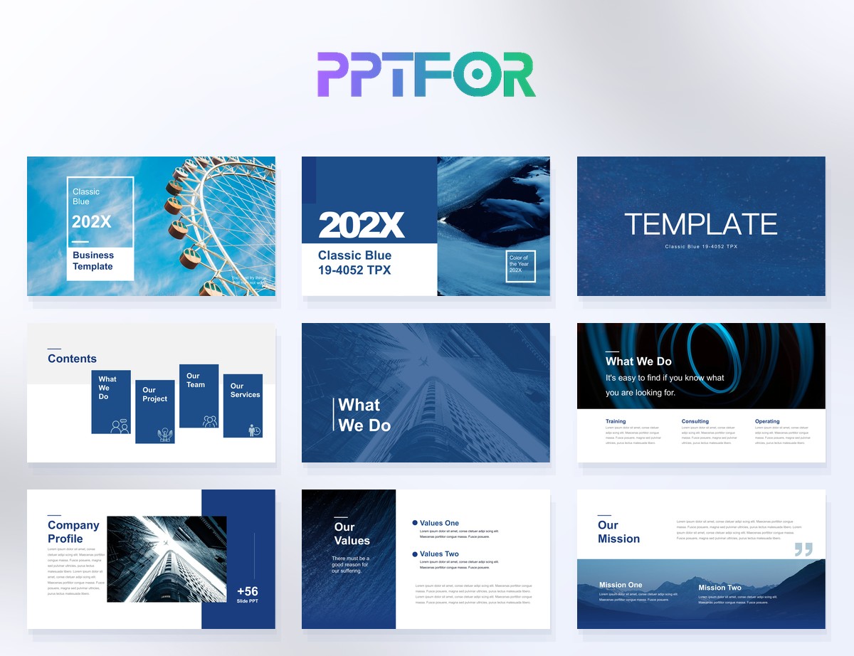
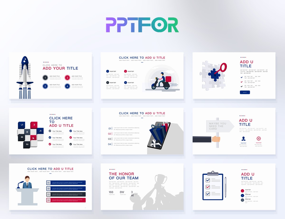
Using a structured template from the Data & Analytics Reports collection helps you stay focused on insights instead of formatting.
Most effective analysis report presentations follow a simple structure. You can adapt it to your team, but these slides cover the essentials.
Start with a clean title slide that answers three questions:
Busy stakeholders may only read this slide. Include:
Use short bullets and simple icons, not paragraphs.
Explain what you were trying to learn and how you measured it:
Show where the data came from and how reliable it is:
These are the heart of your analysis report PPT. For each finding, use one slide with:
If stakeholders want more detail, add:
Always end with action. Summarise:
Put detailed tables and extra charts in the appendix so your main story stays clean, but curious stakeholders can still explore more.
Even the best analysis can look confusing if the slides are poorly designed. Here are practical tips to make your analysis report PPT easy to read.
A common mistake is packing multiple charts onto a single slide. Instead, limit each slide to one main chart or table, with a clear headline and short explanation.
Avoid 3D charts and overly complex visuals.
Use colour to emphasise one line, bar, or number that you want your audience to notice. Keep the rest of the chart in neutral colours so the highlight stands out.
Use short bullets instead of paragraphs. Aim for 3–5 bullets per slide, and make each bullet a complete thought.
Use the same fonts, colours, and chart styles throughout your analysis report PPT. A good template will enforce this consistency for you.
Not every PowerPoint template works well for data presentations. When you browse the Data & Analytics Reports templates, look for these characteristics:
Check that the template includes:
The template should have multiple layouts for:
Prefer templates with simple colour schemes and typography so you can quickly adapt them to your brand by changing a few theme colours and fonts.
Instead of rebuilding the same slide structures every time, you can start from a ready‑made template and focus on your actual analysis.
An analysis report PPT should include a title slide, executive summary, objectives and metrics, data overview, key findings, deep‑dive or segmentation slides, recommendations, and an appendix. This structure keeps the presentation focused and easy to follow.
Most analysis report PPTs work well with 10–20 slides. The exact number depends on your audience and complexity, but it’s better to keep the main story short and move detailed charts to the appendix.
You can make your deck more professional by using a clean analysis report PPT template, using consistent chart styles, writing clear headlines, and limiting each slide to one main message. Templates from the Data & Analytics Reports collection are designed for this purpose.
Yes. A well‑designed analysis report PPT template can be reused for monthly or quarterly reports, as long as you update the data, charts, and insights. Reusing the same structure also makes it easier for stakeholders to follow your presentations over time.
Get full access to our entire collection of premium PPT templates for one simple price.
Forget about complex tools or technical skills—just choose, edit, and download.