 Get full access to premium PowerPoint templates at a limited-time price.Get Now
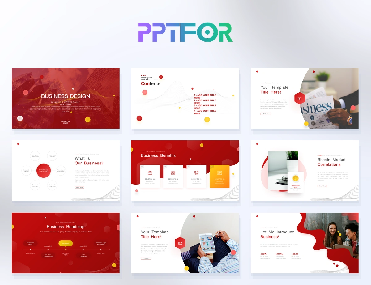
Quarterly business reviews, project updates, and KPI reporting are some of the most important presentations your team creates each quarter. Without a clear template, your deck can turn into a messy mix of charts, paragraphs, and half‑finished slides.
In this guide, you’ll learn:
If you already have a template, you can skip to the step‑by‑step instructions or the FAQ at the end.
Quarterly reviews and project updates are high‑visibility meetings. They are often attended by executives, board members, and cross‑functional teams. Without a clear structure, your deck risks looking like a random collection of data instead of a coherent story.
A structured quarterly review template helps you:
Templates from the Business & Corporate collection are built to support this kind of structured, data‑driven review.
Most successful quarterly reviews follow a simple 8–10 slide structure. You can adapt this for your team or project, but it’s useful to keep the core order consistent.
Include:
Keep this slide clean and easy to reuse.
Give a high‑level overview:
Use simple charts and short bullets, not long paragraphs.
Show the metrics that matter:
Highlight only 3–5 KPIs per slide.
Update your audience on key projects:
A simple timeline or Gantt‑style slide works well here.
Be honest about what’s not working:
This slide often gets under‑designed, but it’s one of the most important.
Briefly show your team’s health:
End with a forward‑looking view:
Include backup slides:
Keep these separate from the main story.
When you browse templates in the Data & Analytics Reports or Business & Corporate categories, watch for these qualities:
Even with a good template, many teams make the same mistakes.
It’s tempting to show “everything.” Instead, pick 3–5 KPIs per slide and keep the rest in the appendix.
Stacked charts, 3D effects, and tiny legends hurt clarity. Use simple bar or line charts where possible.
Use colour to highlight growth vs. decline or targets vs. actuals so the audience can see it at a glance.
Presenters tend to write paragraphs. Turn them into short bullets that support your talk.
Each slide using a different structure confuses the audience. A template that enforces a consistent layout helps you avoid this.
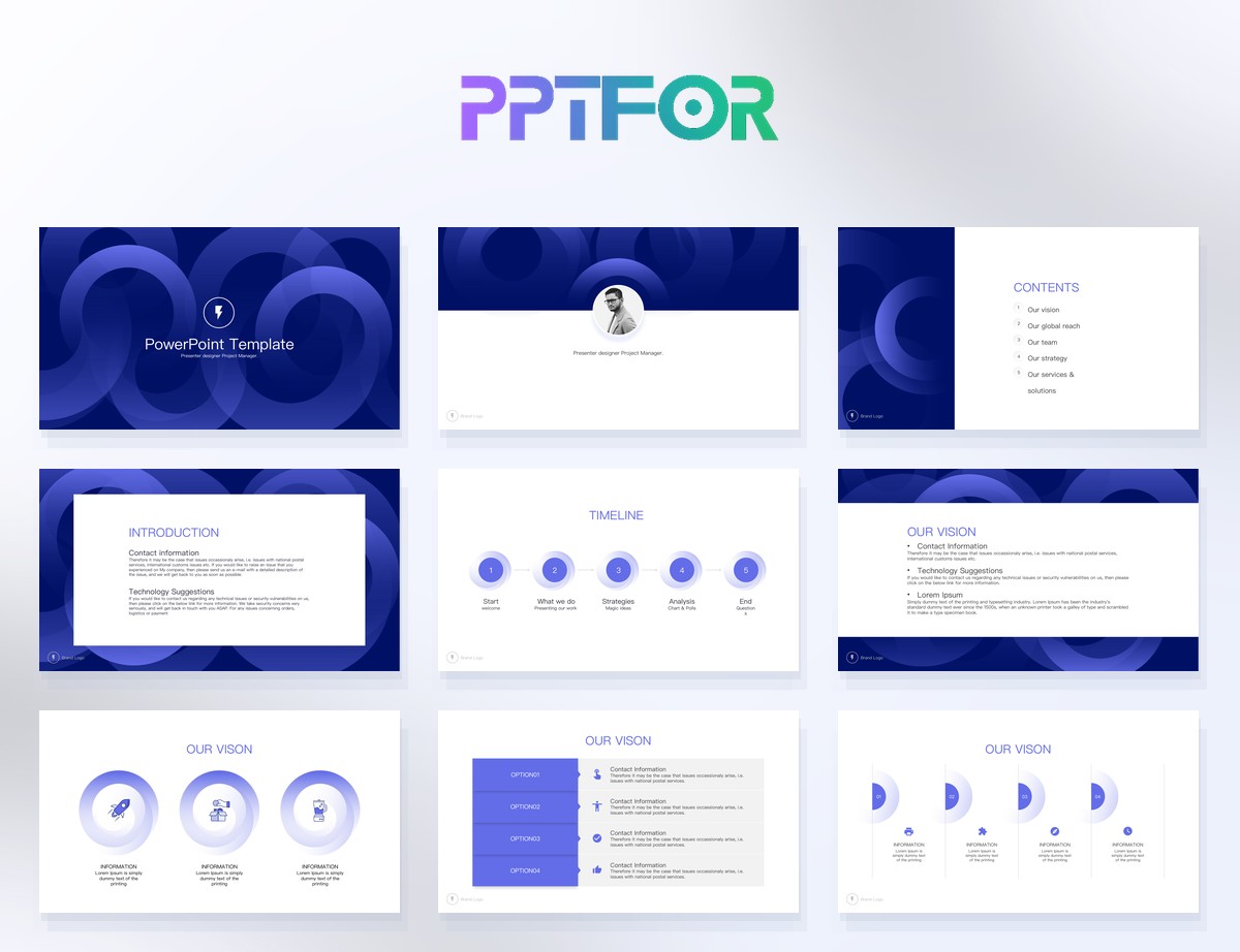
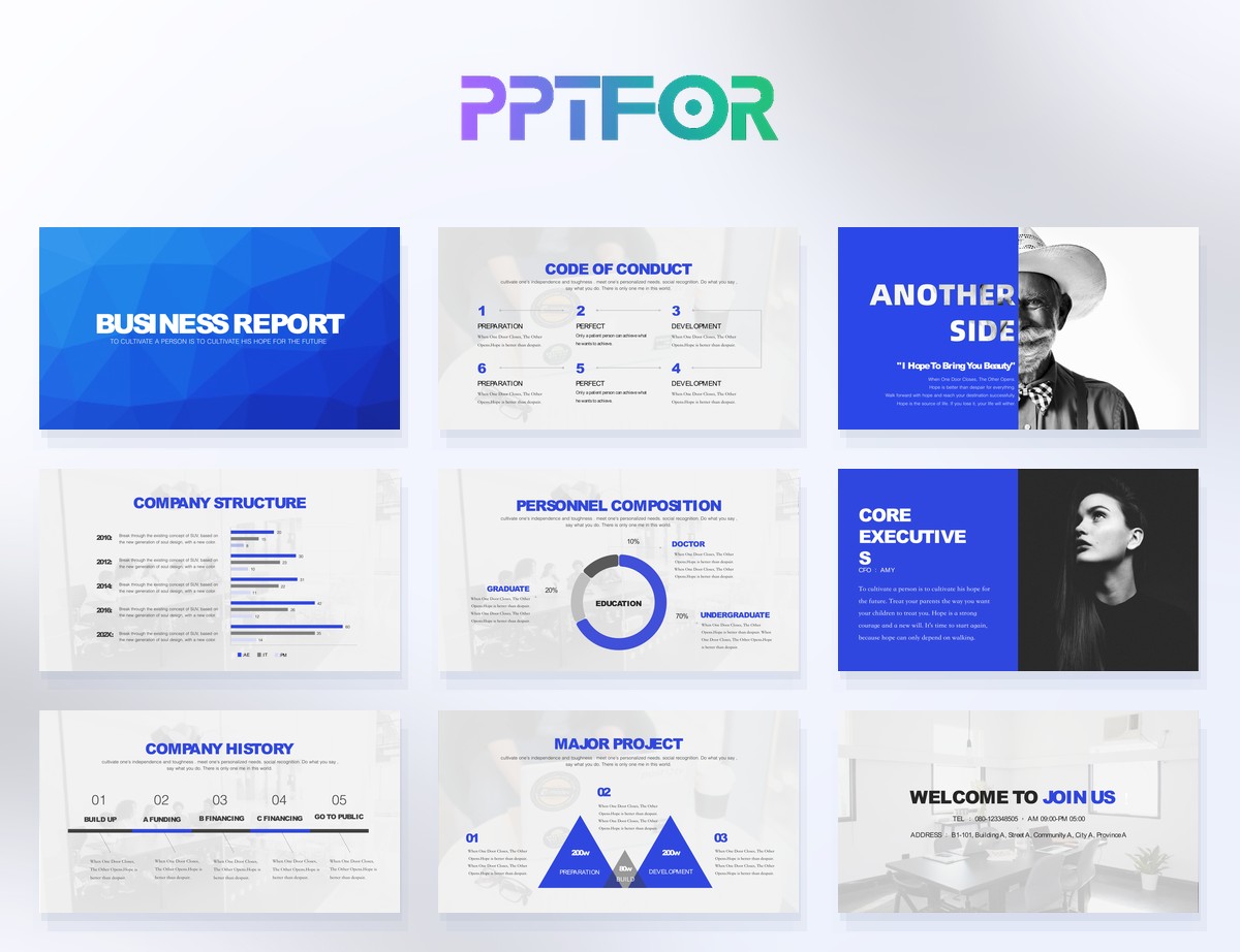
You don’t need to start from scratch. Templates in the PPTFOR downloads library already solve the layout and structure for you.
Use a Business & Corporate template with clear KPI pages and summary slides.
Choose a template with timeline or project update slides, and keep the layout consistent across quarters.
Pick a Data & Analytics Reports style template that already has clean chart layouts and KPI‑style cards.
A typical quarterly review should include a title slide, executive summary, KPIs & performance metrics, project updates, risks & challenges, team & capacity, next‑quarter outlook, and an appendix. This structure keeps the deck focused and easy to follow.
You can make a quarterly review look more professional by using a clean PowerPoint template that matches your brand, turning long text into short bullets, keeping your layout consistent, and using simple charts and colour‑coding for trends.
Yes. Reusing the same template structure each quarter helps your audience quickly understand the deck and makes your reporting look more consistent over time.
A solid quarterly review template can usually be reused for project updates and KPI reporting, especially if it has clear KPI and timeline slides. Just update the content while keeping the layout unchanged.

Get full access to our entire collection of premium PPT templates for one simple price.
Forget about complex tools or technical skills—just choose, edit, and download.