 Get full access to premium PowerPoint templates at a limited-time price.Get Now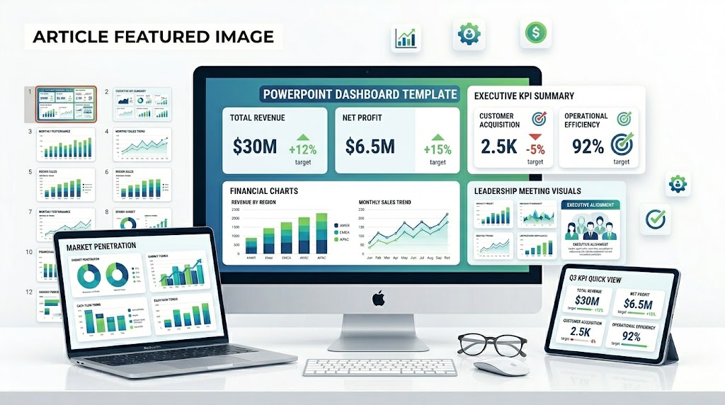
A KPI dashboard PowerPoint template is an editable presentation deck used to show key performance indicators, business metrics, trends, targets, and action items in a visual dashboard format. It helps teams present performance clearly for executives, managers, clients, and stakeholders.
The best KPI dashboard templates do not simply place numbers on a slide. They help the audience understand whether performance is on track, what changed, why it changed, and what action should happen next.
If you need a ready-made KPI Dashboard PowerPoint Template, choose an editable PPTX deck with metric cards, dashboard layouts, trend charts, comparison slides, performance summaries, and recommendation pages. A good dashboard template should work for executive reports, business reviews, marketing updates, sales performance, financial reporting, and project status meetings.
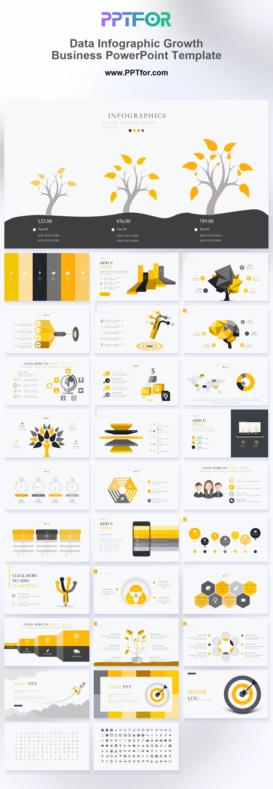
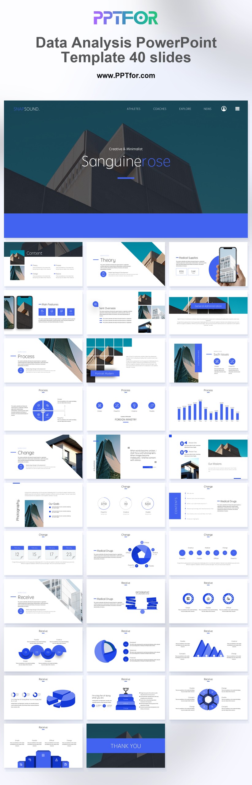
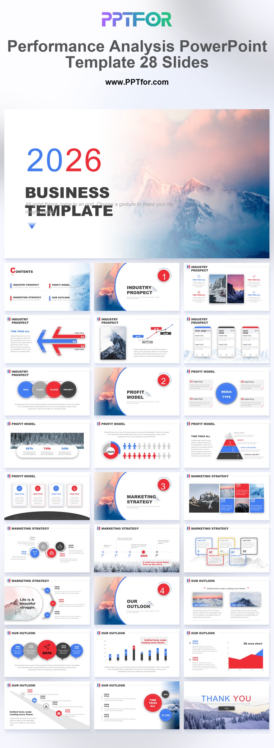
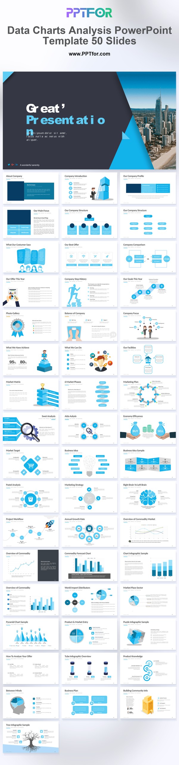
You can browse the full Data & Analytics Reports PowerPoint Templates collection, or start with templates such as Data Infographic Growth Business PowerPoint Template, Data Analysis PowerPoint Template, Performance Analysis PowerPoint Template, and Data Charts Analysis PowerPoint Template.
A strong KPI dashboard PowerPoint template should include KPI cards, trend charts, target comparisons, status indicators, performance summaries, insights, risks, and next steps. For executive audiences, the dashboard should focus on the few metrics that explain business health and support decisions.
| Dashboard Element | Purpose | Best For |
|---|---|---|
| KPI Cards | Show the most important metrics in a compact format | Executive summaries and quick updates |
| Trend Charts | Show how performance changes over time | Monthly, quarterly, and annual reviews |
| Target vs. Actual | Compare current performance against goals | Leadership updates and performance reviews |
| Status Indicators | Highlight whether metrics are on track, at risk, or off track | Management dashboards and project reports |
| Segment Breakdown | Compare regions, products, channels, teams, or customer groups | Sales, marketing, operations, and finance reports |
| Insights Slide | Explain what the dashboard means | Decision-making presentations |
| Action Plan | Connect metrics with next steps and owners | Executive reports and business reviews |
A KPI dashboard PowerPoint template is a pre-designed PPT or PPTX file for presenting key performance indicators in a clear visual layout. It usually includes editable cards, charts, tables, scorecards, progress bars, comparison sections, and summary slides.
Teams use KPI dashboard templates for executive reports, business performance reviews, quarterly reports, sales updates, marketing dashboards, financial reporting, operations reviews, and client presentations.
The purpose of a KPI dashboard is to make performance easier to understand. Instead of forcing the audience to read a spreadsheet, the dashboard turns important metrics into a visual snapshot that supports faster decisions.
A KPI dashboard template and a KPI report template are closely related, but they serve different purposes. A dashboard gives a fast visual snapshot. A report usually provides more explanation, context, and recommendations.
| Template Type | Main Focus | Typical Audience |
|---|---|---|
| KPI Dashboard PowerPoint Template | Visual snapshot of key metrics, status, and trends | Executives, managers, clients, stakeholders |
| KPI Dashboard PPT Template | Editable PowerPoint slides for presenting KPIs in meetings | Business teams, consultants, analysts, managers |
| KPI Report PowerPoint Template | Detailed performance explanation with insights and next steps | Leadership teams, analysts, department heads |
| Executive KPI Dashboard Template | High-level business health, risks, and decisions | Senior leaders and board members |
| Performance Dashboard Template | Progress against targets, benchmarks, and previous periods | Operations, sales, marketing, and finance teams |
Use a KPI dashboard template when the audience needs a quick view of performance. Use a KPI report template when the audience also needs detailed interpretation and recommendations.
A PowerPoint KPI dashboard is best for presenting a snapshot of performance in a meeting. Excel, Power BI, Tableau, and other BI tools are better for live data exploration, filtering, and ongoing dashboard monitoring.
| Format | Best Use | Limitation |
|---|---|---|
| PowerPoint KPI Dashboard | Executive reports, client presentations, business reviews, board updates | Not ideal for live data exploration |
| Excel KPI Dashboard | Spreadsheet-based tracking, calculations, and internal reporting | Can look less polished in executive presentations |
| Power BI or Tableau Dashboard | Interactive dashboards, filters, large datasets, recurring reporting | May need screenshots or exports for presentation decks |
If your audience needs to discuss results in a meeting, a KPI dashboard PPT template is often the most practical format. If your team needs to investigate live data, use a BI dashboard and then summarize the key findings in PowerPoint.
Use this step-by-step process to turn a KPI dashboard PPT template into a clear performance presentation. The goal is to make the metrics useful, not just visually attractive.
If you are building a KPI dashboard presentation from scratch, use this structure as a practical starting point:
A good KPI dashboard PowerPoint template should be clear, editable, and easy to scan. It should help the audience understand performance quickly without making the slide feel crowded or confusing.
The right dashboard template depends on the type of metrics you need to present and the audience that will review them.
| Use Case | Best Template Style | Helpful PPTFOR Template |
|---|---|---|
| Growth metrics dashboard | Visual metric cards with charts and infographic sections | Data Infographic Growth Business PowerPoint Template |
| Business data dashboard | Balanced dashboard with charts, data analysis, and summary slides | Data Analysis PowerPoint Template |
| Performance review dashboard | KPI-focused deck with trend, target, and comparison layouts | Performance Analysis PowerPoint Template |
| Chart-heavy KPI report | Data visualization template with multiple chart options | Data Charts Analysis PowerPoint Template |
The best KPI dashboard template depends on the team using it. Each function should choose metrics that reflect its goals, responsibilities, and decisions.
| Team | Common KPIs | Dashboard Goal |
|---|---|---|
| Executive Leadership | Revenue, profit margin, growth rate, churn, forecast accuracy | Understand business health and priorities |
| Sales | Pipeline, bookings, win rate, average deal size, sales cycle length | Track revenue progress and sales efficiency |
| Marketing | Leads, conversion rate, cost per lead, campaign ROI, website traffic | Measure campaign and funnel performance |
| Finance | Revenue, expenses, profit, cash flow, budget variance | Monitor financial performance and risk |
| Operations | Delivery status, cycle time, utilization, defect rate, backlog | Improve execution and process efficiency |
| Customer Success | Retention, churn, NPS, expansion revenue, support volume | Track customer health and satisfaction |
A free KPI dashboard PowerPoint template can work well for simple internal updates, quick metric summaries, or one-time presentations. A premium template is usually better for executive reports, client-facing decks, recurring business reviews, and branded performance presentations.
| Option | Pros | Best For |
|---|---|---|
| Free KPI Dashboard Template | Fast to start, simple layouts, no cost | Internal updates and basic metric slides |
| Premium KPI Dashboard Template | More slide layouts, stronger visual polish, better chart variety | Executive reports, client decks, recurring reviews |
| Custom KPI Dashboard Template | Brand-specific design and tailored reporting structure | Enterprise teams, agencies, consultants, leadership reporting |
A KPI dashboard becomes useful when every number has context. A metric by itself is only a number. A metric with target, trend, and interpretation becomes a decision signal.
For every major KPI, answer these questions:
For example, instead of writing “Conversion rate declined,” write “Conversion rate declined from 4.2% to 3.5% this month, mainly due to lower paid search performance. The next step is to review landing page relevance and campaign targeting.”
Many KPI dashboard presentations fail because they show too many metrics and too little interpretation. A dashboard should make performance easier to understand, not turn the slide into a spreadsheet.
If you want to improve your KPI dashboard and performance reporting slides, these PPTFOR guides can help:
A KPI dashboard PowerPoint template is an editable presentation deck used to show key performance indicators, business metrics, trends, targets, and action items in a visual dashboard format.
A KPI dashboard slide should include headline metrics, targets, actual results, trend charts, status indicators, short insights, and next steps. The goal is to help the audience understand performance quickly.
Most KPI dashboard slides work best with 5 to 8 key metrics. If you need to show more detail, use additional slides or an appendix instead of crowding one dashboard.
A KPI dashboard gives a quick visual snapshot of performance. A KPI report usually includes more explanation, analysis, context, and recommendations.
Yes. KPI dashboard templates are useful for executive reports because they summarize business health, targets, trends, risks, and action items in a format senior leaders can review quickly.
Line charts work well for trends, bar charts work well for comparisons, metric cards work well for headline KPIs, and tables work well for detailed values. Avoid chart types that make the message harder to read.
Yes. Many PPT and PPTX KPI dashboard templates can be opened in Google Slides. Some fonts, chart formatting, animations, or advanced PowerPoint elements may need adjustment after import.
A KPI Dashboard PowerPoint Template helps teams turn performance data into clear business communication. The best templates combine metric cards, charts, targets, trends, insights, and action plans in a format that is easy to edit and easy to present.
If your audience needs a fast decision, focus on the few KPIs that matter most. Add targets, trends, and interpretation so every metric has meaning. A strong KPI dashboard does not just show performance. It helps the audience decide what to do next.

Get full access to our entire collection of premium PPT templates for one simple price.
Forget about complex tools or technical skills—just choose, edit, and download.