 Get full access to premium PowerPoint templates at a limited-time price.Get Now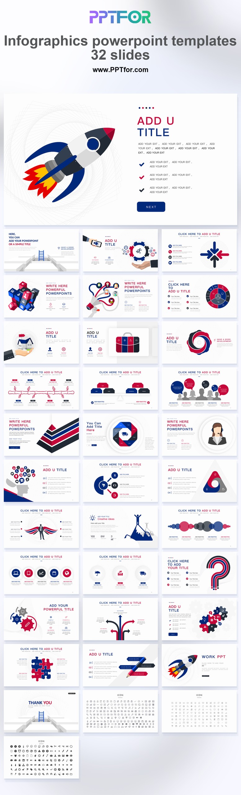
The best infographic PowerPoint templates help an audience understand relationships, sequences, comparisons, and trends faster than a text-heavy slide. They provide editable visual systems for presenting data without rebuilding every chart, process, or icon layout from scratch.
This guide compares five PPTFOR infographic products and explains which visual formats work best for reports, strategy decks, training, consulting, and executive presentations.
An infographic PowerPoint template is a collection of editable slides that combine shapes, icons, charts, labels, and visual hierarchy to explain information. Unlike a static image, a well-built PPT template lets you change the text, colors, data, size, and arrangement of the elements.
Business infographic slides are most useful when the audience needs to understand one of these patterns:
The visual should clarify the message. If the infographic requires a long explanation before the audience can read it, a simpler chart or table may be more effective.
| Template | Best for | Included visual direction |
|---|---|---|
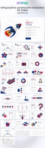
| Infographics PowerPoint Template – 32 Slides | General business, reporting, and branded presentations | 32 slides with editable vector graphics, drag-and-drop placeholders, and PowerPoint, Google Slides, and Keynote compatibility |
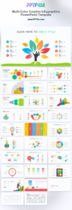
| Multi-Color Creative Infographics PowerPoint Template | Strategy pitches and training decks | 27 editable slides with charts, icons, and colorful layouts |
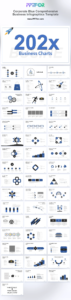
| Corporate Blue Comprehensive Business Infographics Template | Executive reviews and consulting frameworks | 52 editable slides with corporate blue icons, charts, and structured business visuals |
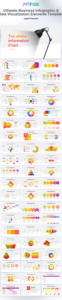
| Ultimate Multi-Color Business Infographics Mega Element Pack | Teams that need a large reusable visual library | More than 100 editable vector slides for process maps, dashboards, and pitch visuals |
| Business Infographic & Data Visualization Elements Template | Performance reports and strategy presentations | 45 editable slides with business infographic and micro-visualization layouts |
Use a process layout when the order of actions matters. Keep the number of visible steps manageable and use parallel wording for every label. A horizontal flow works well for short sequences; a vertical flow provides more room for explanation.
Use a timeline for events, phases, releases, or milestones. Show only dates that affect the story. If exact duration matters, use a scaled timeline rather than equally spaced milestones.
Use two or three consistent columns to compare products, strategies, segments, or scenarios. Apply the same criteria in the same order so the audience does not have to reconstruct the comparison.
Combine a large value, short label, unit, and relevant comparison. Avoid filling a slide with isolated numbers; group metrics by business question or stage of the funnel.
Use hierarchy layouts for organizational structures, priorities, product architecture, or category relationships. Make reporting lines or levels explicit rather than relying only on size.
Cycles work for repeated processes such as planning, execution, measurement, and improvement. Do not use a circular layout for a process that has a clear beginning and end.
Use maps when geography is relevant to the conclusion. Pair the map with labels or a ranked list when small color differences would be difficult to interpret.
Executive decks usually need restrained visuals, clear hierarchy, and fewer elements. Training and workshop decks can support more detailed diagrams. Marketing and creative presentations may benefit from a broader color range, but the information still needs a consistent reading order.
Confirm that the important elements are editable PowerPoint shapes rather than a flattened image. Editable vectors make it easier to match brand colors, resize elements, and remove unnecessary detail.
Count the types of layouts you will actually use. A smaller focused deck may be enough for one report. A larger element pack is more useful for teams that prepare different presentations every week.
Mixing unrelated infographic styles can make a presentation feel fragmented. Select a template with a coherent icon, line, shape, and color system, then reuse those rules across the deck.
For brand-level changes, follow the guide to customizing PowerPoint template colors, fonts, and logos. When the slide contains detailed analysis, use the principles in Analysis Report PPT: How to Present Data Clearly.
A good template has editable elements, clear hierarchy, consistent visual rules, and a useful range of process, comparison, timeline, KPI, and framework slides. It should remain readable after the sample content is replaced.
Yes, when the visual simplifies a business relationship or decision. Use restrained colors, fewer elements, and direct labels. Avoid decorative complexity.
Sometimes. Use an infographic for a small set of values or a conceptual relationship. Use a conventional chart when the audience needs to compare many values, see a trend accurately, or evaluate statistical variation.
The featured product pages specify available formats and compatibility. Several include Microsoft PowerPoint, Google Slides, and Apple Keynote support; confirm the individual product before downloading.
Begin with the 32-slide Infographics PowerPoint Template for a focused deck, or choose a larger business infographic pack when your team needs reusable visuals across reports, strategy presentations, and training materials. Select only the layouts that support the message and keep the visual language consistent from slide to slide.
Browse the complete infographic PowerPoint template collection, including the Blue Infographic PowerPoint Template, Multi-Color Creative Infographics Template, and Business Infographic and Data Visualization Template.
Get full access to our entire collection of premium PPT templates for one simple price.
Forget about complex tools or technical skills—just choose, edit, and download.