 Get full access to premium PowerPoint templates at a limited-time price.Get Now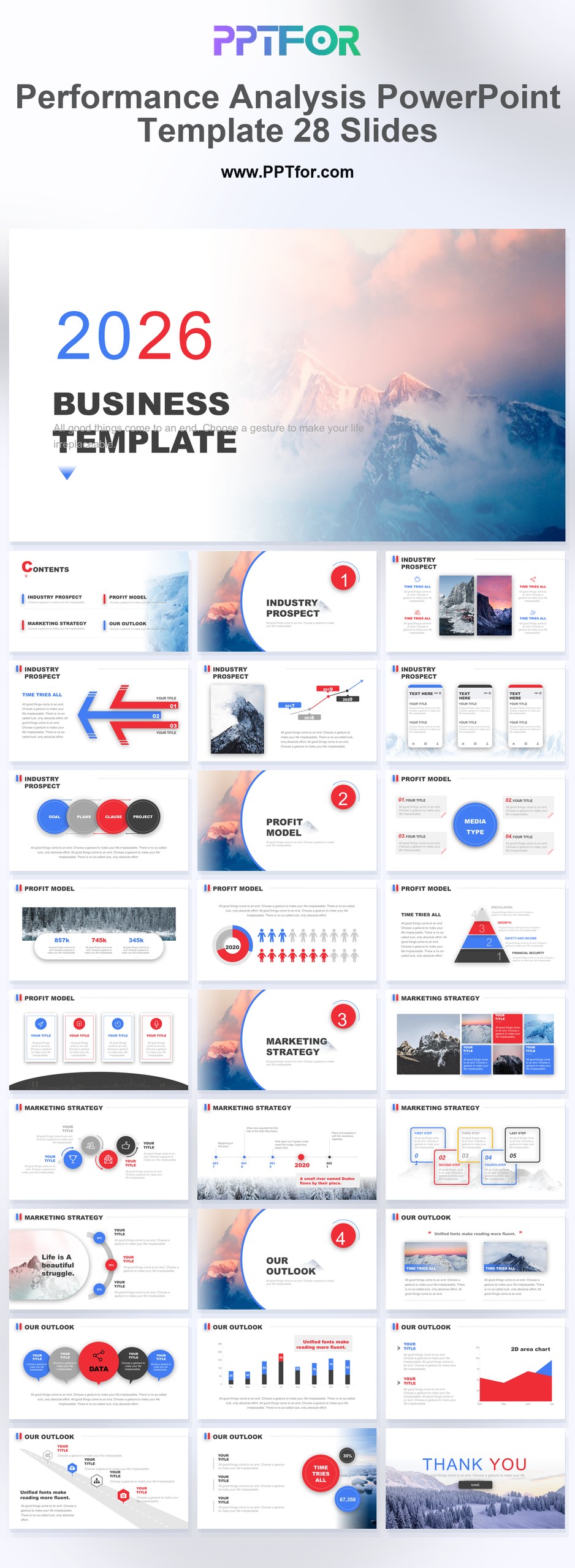
A website performance report template in PPT helps teams turn analytics data into decisions. Instead of pasting disconnected screenshots from several platforms, the presentation organizes traffic, acquisition, search visibility, engagement, conversion, and technical performance into one clear narrative.
This guide provides a practical slide structure and four editable PPTFOR templates for presenting website results to executives, clients, marketing teams, and product stakeholders.
A website performance report explains how a website performed during a defined period and what the organization should do next. It combines outcome metrics, diagnostic metrics, and interpretation.
The report should answer:
The exact metrics depend on the website. An ecommerce site, lead-generation site, publisher, and SaaS product should not use an identical scorecard.
State the reporting period, overall performance, major changes, and top recommendations. Limit the slide to findings that affect a decision.
Define the website’s primary objective, conversion events, data sources, comparison period, and any tracking limitations. This prevents the audience from interpreting metrics outside their context.
Show current value, target, previous period, and variance for the most important KPIs. Typical metrics include conversions, conversion rate, revenue or leads, qualified sessions, and cost per acquisition.
Display users or sessions over time and annotate campaign launches, tracking changes, outages, or seasonality. Avoid reporting traffic growth without explaining whether it improved business outcomes.
Compare organic search, paid search, direct, referral, email, social, and other channels. Include conversion or value metrics beside traffic volume so channel quality is visible.
Summarize clicks, impressions, click-through rate, and average position from Google Search Console. Add top queries, landing pages, and meaningful changes. Separate branded and non-branded demand when that distinction affects the conclusion.
Rank key landing pages by traffic, conversion, or business value. Include the page purpose and recommendation rather than presenting a long URL table without interpretation.
Use engagement rate, time, depth, repeat usage, or event completion metrics that reflect the experience. Segment by device or audience when the aggregate hides an important difference.
Show the major stages between entry and conversion. Include the rate between stages and identify the largest loss point.
Report availability, load performance, Core Web Vitals, errors, or other technical metrics that affect experience and search. Connect technical issues to affected pages or user groups.
Prioritize actions by impact, confidence, and effort. Assign an owner, target date, and expected outcome. Move detailed query, page, and event tables to an appendix.
| Template | Best for | Useful features |
|---|---|---|
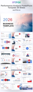
| Performance Analysis PowerPoint Template – 28 Slides | Executive website KPI and trend reporting | 28 slides for market metrics, business charts, and data insights |
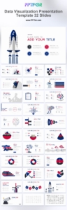
| Data Visualization Report Presentation Template – 32 Slides | Channel, page, funnel, and comparison reporting | 32 editable slides for data findings, SWOT reviews, and business reports |
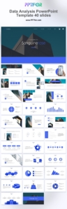
| Data Analysis PowerPoint Template – 40 Slides | Detailed analyst and client presentations | 40 slides designed for findings, market analysis, and structured data reporting |
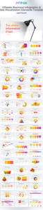
| Business Infographic & Data Visualization Elements Template | Teams building a reusable analytics slide library | 45 editable slides with business infographics and micro-visualizations |
Do not treat average position as a universal ranking. It is an aggregate across queries, locations, devices, and result types. Present it beside clicks, impressions, and click-through rate, then use query and page detail to explain the change.
A concise search-performance section can include:
Use tables for exact values and charts for trends. If the dataset is small, state that limitation instead of presenting percentage changes without context.
Start with the business model.
Limit the executive scorecard to metrics that reflect outcomes. Use secondary metrics to explain why those outcomes changed.
For broader analytical storytelling, see Analysis Report PPT: How to Present Data Clearly. The KPI Dashboard PowerPoint Template guide explains how to design a concise scorecard, while the Project Status Report PowerPoint guide provides a useful action and ownership structure.
Include objectives, a KPI scorecard, traffic trends, acquisition channels, organic search, landing pages, engagement, conversion, technical performance, findings, and an action plan. Adapt the metrics to the website’s business purpose.
Operational teams may review dashboards weekly, while a decision-focused PowerPoint report is usually prepared monthly or quarterly. Use the same definitions and core slide structure so changes are easy to compare.
They can be presented in the same report, but their metrics and scopes should remain clearly labeled. Search Console describes Google Search visibility and clicks; analytics platforms describe measured activity after users reach the site.
An executive report can often be completed in 8 to 12 main slides. Put detailed query, landing-page, campaign, event, and technical tables in an appendix.
Use the Performance Analysis PowerPoint Template as a starting point, select only the layouts required for your website objectives, and replace sample content with verified metrics and concise recommendations. The result should explain what changed, why it matters, and what the team should do next.
Get full access to our entire collection of premium PPT templates for one simple price.
Forget about complex tools or technical skills—just choose, edit, and download.